
It really makes me want to play the game already and find out the meaning of that cutscene.
The Red Button Story - Game Thread/Dev blog


thanks guys, oh and i would like to point out that Scott made the tree in the begining 
My Deviant Art - http://black-crusader.deviantart.com
I rather enjoyed it too. However, there are a few small details that could be worked out in my opinion.
1: The time between scenes could deal with a little work. Particularly around the conveyor belt thing and the description. I know that the slow moving along that conveyor belt thing is good for building suspense, but I think that it could have ended earlier. I also had more than enough time to read the short description(written very well by the way). Just my personal preference.
2: It may just be me, but the opening bothers me. The head entering from the right just doesn't feel right.I would have preferred the head towards the center in the beginning and then slowly closing in on the eye like you did after the head was on screen.
3: The quality of the logo didn't seem that good (microsoft paint feel). It may just be youtube but I would prefer a shinier less pixely version. Also, if it faded in instead of just appearing, it would look a bit more impressive.
Well, that's basically it. Other than that, I loved it. Better than anything I could ever do. Keep up the good work!
thank you very much for the kind words, I much appreciate it, I think you missed what was going on in the vid a bit, but its not your fault, its just because of the screen size, its not a converybelt but rather large cubes of stone floating out over a sea of slaves. But yeah also that image is very nice and crisp in the 800x600 high quality version so no worries there, I might try it fading in and out.
About the guys head rotating, I dont really dislike it enough to re render the whole scene myself, so It might stay like that or might not. I just liked it keeping the screen starting from black.
but yeah thanks
About the guys head rotating, I dont really dislike it enough to re render the whole scene myself, so It might stay like that or might not. I just liked it keeping the screen starting from black.
but yeah thanks
My Deviant Art - http://black-crusader.deviantart.com
wow, i just saw it and it's indeed very beutyfull. I really want to play that game, the story seems very interesting, even if it's not actually the type of game i like in general. The cutscene is just, well, amazing! It gives you questions, and you have to find the answers.
Everyone can see the difficult, but only the wise can see the simple.
-----
-----
thanks man and yeah thats the idea, its a different kinda game, thanks for the comment
My Deviant Art - http://black-crusader.deviantart.com

wow!
yes yes! the cutscenes i made were amazing for the teaser!
and YES! as jason said! that it's kinda hard to decipher what is going on in the vid on YOUTUBE.. as it is just too small...
all in all! the Music + Video Transition fx makes it perfect!
Music thanx to Nick!
and oh yeah! i dont agree that the logo should fade...
it is excellent the way it is not.. especially the fact that it appears and the sound compliments it!
amazing!
=]

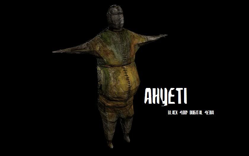
Finally i have something to show ounce again.
I have re done the main character and this is the first draft (needs to be re texture mapped)
I have re done the main character and this is the first draft (needs to be re texture mapped)
My Deviant Art - http://black-crusader.deviantart.com